SI SCOTT's work is on my mind all the time these days.
These images don't feel like they're mere pictures, they are full of so much energy that its bursting off the page!
I just sit with a tracing paper and keep going over my favourite parts and I can see how he lays out the pattern. The drawings flow and move, they have completely taken me in.
I am completely flabbergasted by the details and the intricacy of his lines. His work takes me to a dimension where time, place, cold, heat, hunger, thirst, nothing matters.
Musings...A product of contemplation; a thought. "an elegant tapestry of quotations, musings, aphorisms, and autobiographical reflections" (James Atlas).
Tuesday, 5 November 2013
Wednesday, 28 August 2013
Architecture and Sociolinguistics-2
There are a series of possibilities happening together really quickly and new avenues opening up for exploration.
I recently read about the first 3D printed room (http://www.dezeen.com/2013/06/26/digital-grotesque-the-worlds-first-3d-printed-room/) and I see the revival of intricate details that have become very rare since the cost and time of labour has become an issue.
and the first 3D printed house (http://www.popsci.com/technology/article/2013-08/watch-assembly-3-d-printed-shack)
In continuation to what I started to mull over earlier, there is a need for an interior that can be modified to rapidly changing needs of a building to be in sync with a rapidly changing world, this technological advancement is becoming a great cause of sleepless nights.
I am now beginning to wonder if 3D printing can somehow be combined with nanotechnology to create interior walls and partitions that have 2 or maybe 3 types of presets that can be changed as needed. Dr. Michio Kaku is a physicist, he may be either a visionary or a mad man but I seem to like his proposals. He thinks it may be possible to incorporate nanotechnology in objects that change themselves into whatever you need them as usage requires, for example your table could change itself into a chair or any other type of object. I imagine there would be some presets that can be programmed into the object and we would be able to make a choice based on that. So maybe we can have different wall types programmed and preset to change with need, if a room requires more privacy we would be able to switch the wall to an acoustic partition or increase the fire resistance if we need to store valuable and sensitive material.
With 3D printing, perhaps we can change an entire floor plan and do away with messy construction and save time. How long before we can save money is a different matter altogether, but the possibilities seem endless.
Tuesday, 9 July 2013
Architizer Blog » James Nizam Tears Down Walls For The Perfect View
Architizer Blog » James Nizam Tears Down Walls For The Perfect View
Ethereal, quite lovely experiments with light and structure.
Ethereal, quite lovely experiments with light and structure.
Two triangles -- so much fun!
The Shard is my favourite
Drill holes through the studio wall-Awesome!
Visible light
Sunday, 7 July 2013
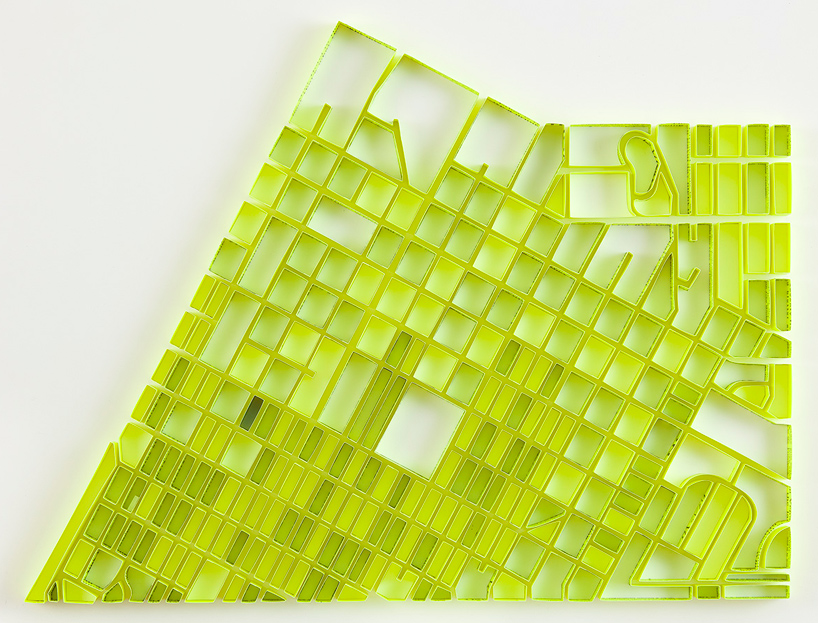
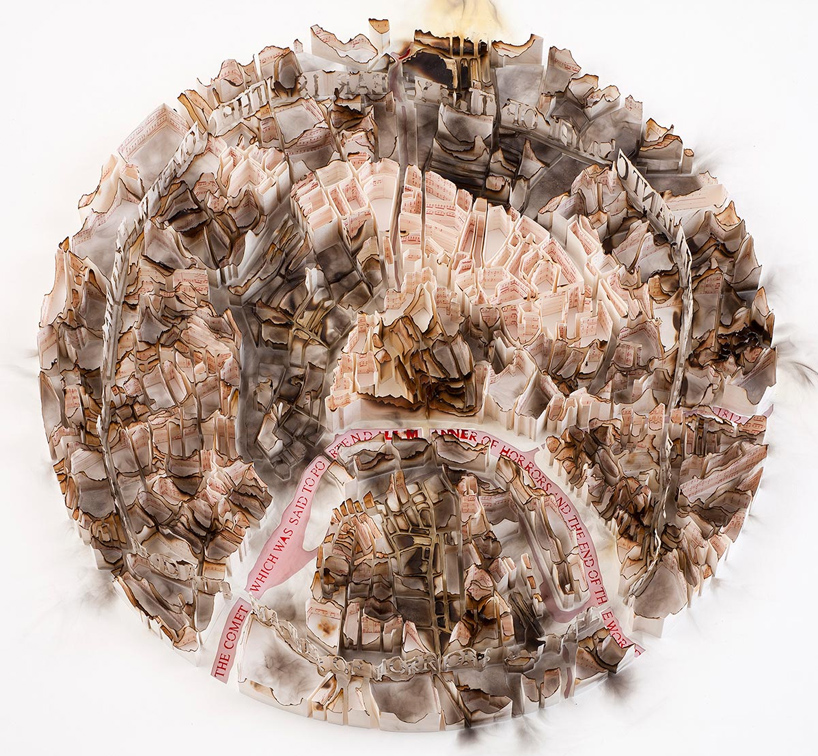
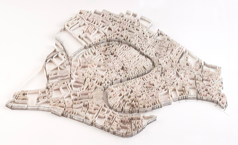
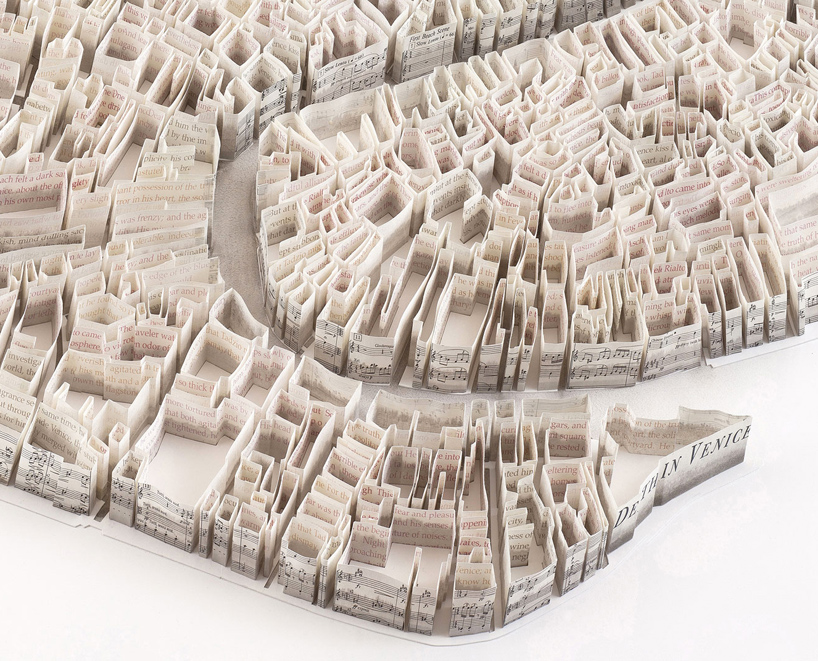
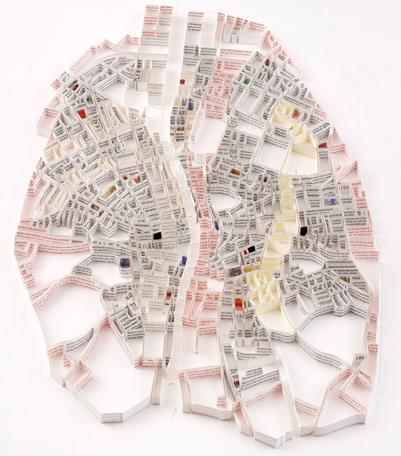
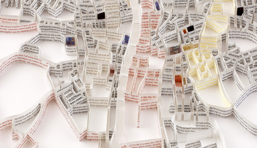
Matthew Picton's paper map sculptures
Paper Map Sculptures
(This article has been taken from designboom)
"matthew picton is a British born artist living in Oregon USA. his work is influenced by cartography and the inherent beauty of lines and forms that arise from natural topography and built environments. his series of 'city sculptures' look at the organism of the city as an entity which has been shaped by social, political, economic and topographic factors, illustrating a systemic pattern of human civilization. he explores roads at the micro level, tracing miniature byways in cracked sidewalks and alleys.
A continuous visual narrative of a city's transformation, his sculptures are layers of history, documenting their early beginnings and depicting their contemporary state, expanding beyond their original forms. meticulously built by hand from individual strips of paper, each sculpture is more than a mere three-dimensional city map. Picton tries to emphasize a city’s distinct and unique personality. several of his maps depict cities such as Venice, London, Las Vegas or Moscow before and after a war of natural disaster, using charred or crumbled paper."
Las Vegas
Moscow 1812
Venice
Venice (close-up)
Dublin 1904
Dublin 1904 (close-up)
Wednesday, 26 June 2013
Tatiana Bilbao's Geometric Shapes

Biotechnological Park, Culiacan, Mexico, 2013
Azure recently published Mexican Architect Tatiana Bilbao's profile and the way she uses geometric shapes really caught my eye. I love how the forms intersect and join. Each shape, and line has its own identity, and yet it is at home with its surroundings.
(link to the article here)

Open Air Auditorium, Culican Botanical Gardens, Mexico, 2005-2014

Jinhua Pavilion, Jinhua architecture park, China 2007.
Labels:
architecture,
Azure,
China,
geometric shapes,
Mexico,
Tatiana Bilbao
Thursday, 6 June 2013
Fujimoto's transparent landscape
This is the 2013 Pavilion of the Serpentine Gallery by Fujimoto. Its a steel structure, just so lovely, and delicate... he designed a cloud that looks light and ethereal hovering over the land.
Read about it and for more pictures here.
Read about it and for more pictures here.
Sunday, 2 June 2013
Architecture and Sociolinguistics
There are many parallels that can be drawn between Architecture and Sociolinguistics, these both fields of applied knowledge share certain common elements which keep showing up. Though it is an old subject, the rapid changes in technology and global economy have created an environment that is unusual to past eras of design.
The primary task of Sociolinguistics is to map linguistic variation on to social conditions, and as Bernard Spolsky writes in his book 'Sociolinguistics', this mapping helps to show two major kinds of variations in language: the first is Synchronic variation (variation at a single point of time) and the second is Diachronic variation (variation over a longer period of time) which is significant changes in language.
Architectural Sociology studies buildings and their use in social contexts. By observing and mapping the use of structures and the needs of the people we may be able to observe not just diachronic changes but also synchronic changes which are happening now. With so many changes in technology taking place such as 3D printing, advances in Artificial Intelligence and robotics, the need to understand the complex interaction between humans and their environment spanning over a period of two years and less has become crucial to designing interiors.
I will be studying and trying to observe more from this perspective and I will try and journal about it here as much as I can.
Thursday, 2 May 2013
Delightful Labour
"The artist's hand does not crawl aimlessly over the paper and trail behind it flowers of the imagination. There is scope in ornament for all the fancy of a fertile brain; but design is no mere overflow of a brimming imagination; it is cunningly built up on lines necessary to its consistency, laboriously, it might be said, were it not that to the artist such labour is delight".
(Lewis F. Day, Pattern Design, 1923)
Redesign of the Queen City Yacht Club, Toronto.
Before:
(Lewis F. Day, Pattern Design, 1923)
Redesign of the Queen City Yacht Club, Toronto.
Before:
After:
Tuesday, 30 April 2013
My favourite green homes
These are some of the spaces that I would love to pick ideas from.
By Ryall Porter Sheridan Architects, the Orient Artist Studio (website):
Almost all of their projects are very nice.
The Hudson Passive Project by Barliswedlick Architects (website):
The Carriag Ridge House by Olson Kundig Architects (website):
The R-house, the team included our Humber profs Craig Crane & Marcin Kedzior with Humber students (website):
The Yin Yang house by Brooks + Scarpa (website):
By Ryall Porter Sheridan Architects, the Orient Artist Studio (website):
Love that screened porch!
Almost all of their projects are very nice.
The Hudson Passive Project by Barliswedlick Architects (website):
Gorgeous large glass front shows off the beautiful high ceiling
The Carriag Ridge House by Olson Kundig Architects (website):
You can see all around with these open views
Great minimal intrusion
The R-house, the team included our Humber profs Craig Crane & Marcin Kedzior with Humber students (website):
The Yin Yang house by Brooks + Scarpa (website):
Subscribe to:
Comments (Atom)


