Thursday, 24 April 2014

Thesis: Centre for the Visually Impaired-The Site and Parti

The Site


photos: Google
The building at 21 Ossington Ave. is over 200 years old and is located near the intersection of Ossington Avenue and Queen Street. Its original purpose was a horse and buggy ‘garage’. It had a ramp going to the second floor for easy transport and storage. Eventually this site turned into a vehicle garage. It has since then changed hands a few times and now ending up as a self-storage facility and a private parking lot.

It is located in a trendy area, as well as an area that the city has taken interest in fixing up. The neighbourhood is looking to get rid of industrial type buildings and conform to the majority of retail, residential, arts and restaurant districts in the area. A storage facility does not belong in this area anymore, and this building has great potential to become a historic icon in this neighbourhood.

The site has access to three transit routes, two of which run directly to subway stations. Although the building is of no significant heritage value, but the heavy timber beams and the brick façade of its original construction lend it a certain character. The building has potential to incorporate modern and historic elements for an engaging appearance.

In Toronto, we orient ourselves with the grid and there is an existing grid in the building because of its original timber structure.These grids have been an influence in the planning.


 The Parti


The Design of this Centre begins with two ideas that form the basis of the concept: 

1. To create a central, social space which can draw in people from the neighbourhood and community to interact with the users of the space and to remove the social barriers.
2. A central axis which can provide a reference point so users can build a mental map of the space.

An entry which leads right to a central, social heart of the space with connections to programs all around it seems to naurally evolve.


Frames of Thought


(bottom two images: Dave Giancarli)

This project has been observed through four frames of thought: 

  1. Society and its perception of visual impairment
  2. How the city and the building codes view solutions for interior spaces
  3. The provision of a comprehensive experience that includes work, education, and cultivation of art not only for the visually impaired but for the community and the neighbourhood.
  4. A study of how the visually impaired navigate their environment and what can be done to help people re-train their senses.

Thesis: Centre for the Visually Impaired-The Research 2

Case Studies


Several case studies were looked into to learn and understand the specific area of design for visually impaired users.

1. The Canadian National Institute for the Blind is the only building in Toronto designed specifically for people with visual impairments.

2. Centre for Scottish War Blinded By Page\Park (dezeen).

3. Landscape Design for the Royal National College for the Blind, Hereford UK

4. Hazelwood School by Alan Dunlop Architects, Glasgow, Scotland

5. Anchor Centre, Denver, Colorado

Thesis: Centre for the Visually Impaired-The Research 1

The Topics that were researched were:


FLOORING AND SURFACES


An essential component to designing any space for the visually impaired is a careful, thoughtful selection of materials. As they rely on the information transmitted to them through their cane, change in surface material are cues and way-finding elements, they must be consistent and intuitive.


COLOUR AND CONTRAST

For the partially sighted the application of colour and suitable contrast is an important consideration. The American Foundation for the Blind has some guidelines on their website:
“Use of Colour Contrast
  • Place light objects against a dark background, a dark table near a white wall, for example, or a black switch plate on a white wall.
  • Install doorknobs that contrast in colour with doors for easy location.
  • Paint the woodwork of the door frame a contrasting colour to make it easier to locate.
  • Mark the edges of all steps and ramps with paint or tape of a highly contrasting colour.” (AFB, 2013)


Lighting


The effective use of colour and contrast must be combined with a careful consideration to lighting as well.
Some of the common difficulties encountered by people with vision impairment, which have been identified by the NCBI, include:
1.       Reduced or non-existent night vision
2.      Difficulties in bright light
3.      Difficulties when moving from bright to darker areas and vice versa
4.      Central vision loss (no detailed vision for reading)
5.      Peripheral vision loss (reduced vision to one or both sides, above or below)
6.      Can only see movement
7.      Can only see blurred outlines
8.      Can only detect light
(NCBI)


Acoustics


Vision being the most dominant of the senses is used to gather information about the environment around us. In the absence or severely reduced performance of sight, hearing is used to compensate for that. 

Successful wayfinding often depends on localizing objects or surfaces in the immediate surroundings (Guth, 1997). Objects can be detected using changes in the ambient sound field as an individual walks and interacts with the environment and can be identified on the basis of any sound they produce (Gaver, 1993). Hearing facilitates the appreciation of depth and distance and enables the understanding of environmental features (W. R. Wiener, 1997)

When designing for people with vision loss, we must keep certain things in mind. The sound produced by the footsteps also helps avoid collisions with other people (Papadopoulos, 2011).

Wayfinding and Sensory Design


According to Carlson, Holscher, Shipley and Dalton, the three factors that contribute to the wayfinding features of a building:
“…the spatial structure of a building, the cognitive maps that users construct as they navigate it, and the strategies and spatial abilities of the building’s users.” (Laura A. Carlson, 2010)

Thesis: Centre for the Visually Impaired-Introduction

The Inspiration

Last summer I came to know about Chris Downey, an architect in San Francisco who had lost his vision in 2008. After two years he decided to return to his profession and adjusted his work to his changed condition. It struck me as how deeply we identify ourselves with our work and when someone loses their vision they lose that part of themselves.

When confronted with blindness an irrevocable change occurs to the way one lives and works. Vision is not only the way we apprehend the world but also structure our reality and what can be known—losing this reference point has consequences on our sense of identity and independence. It is important to help people re-establish their careers and that aspect of their personalities.

As research has led to indicate, currently there are facilities which help people establish a daily life at home, learn their way around using mass transit, read braille if they wish to learn it, and basic computer skills. There are online guides related to career planning but there are no physical facilities in existence in Toronto that expressly help the visually disabled re-establish their professional lives. This thesis will create a foundation for developing a centre that allows users to find alternate ways of recuperating their sense of who they are and the skills necessary for their field.

During research it was discovered that the biggest barrier faced by the visually impaired is society’s perceptions of their capabilities. Society limits them with what it believes they can or cannot do. Claude Steele, the Dean of Sanford’s Graduate School of Education explains in his book ‘Whistling Vivaldi’ how stereotypes affect us. When the object of a stereotype is aware of the negative perception of him/her, that awareness constrains all manner of ability and performance. There is a need to educate people and to create awareness about this segment of our population and to help integrate them into the workforce. The social integration will be a major focus of the design.


The Proposal

The Ossington Centre for the Visually Impaired (OCVI) accommodates a vast array of practitioners including architects/designers and computer engineers, massage therapists and wood workers, artists and sculptors. This centre allows users to find alternate ways of recuperating their sense of who they are and the skills necessary for their field.

To create the much needed interaction with the community and the neighbourhood, there is a café right in the centre of the building which has the advantage of being close to the programs. The programs include a wood workshop and a clay studio on the first floor, on the second floor there is a painting studio, a recording studio, a massage therapy program, a classroom for computer/office skills, and a library for the students. There is a business centre on the first floor and meeting rooms on both levels to enable a broader usage and to create opportunities to generate income for the centre.

The neighbourhood is welcomed by OCVI to make use of its facilities for a nominal fee. People can use the wood workshop, the clay and painting studios, utilize the library, and even rent the recording studio.

To help create a practical design, which is also aesthetically pleasing to the senses, evidence based design will substantiate the requirements of the project which will translate into viable goals and objectives.

The chosen site, 21 Ossington Avenue, has access to three transit routes which run to subway stations. A dynamic artistic community adjacent to the CAMH benefits the users by way of creative, social and psychological ways of mediating the implications of vision loss.


Saturday, 15 March 2014

Transformations

There's one stucture on Toronto's waterfront that has been on my mind for quite some time now.
The old concrete building of Canada Malting Co. needs attention and new ideas.

Architizer recently posted some really cool design ideas by Thomas Heatherwick to transform silos, his ideas have inspired other artists and architects for some really interesting projects.

Rendering of Heatherwick's silo-to-museum transformation.

Rendering of the exterior view of the museum.
Interior rendering of the V&A Museum in Cape Town. 


By MVRDV we have the Gemini Residence
Gemini Residence, Copenhagen, Denmark

My favourite by NL Architects, these 'Climbing' towers have multipurpose areas, offices, restaurants, and other commercial spaces:
Climbing Center, Amsterdam, Netherlands

Though personally not one for the extreme thrills, but the idea of a skydiving centre by MOKO in Warsaw, Poland, is also pretty good:
Skydiving Center, Warsaw, Poland

Love this sensory art installation by the Lighting Design Collective, they transformed this unused oil silo in Helsinki:
Silo 468, Helsinki, Finland

Architizer describes it, "Thousands of white and red LED lights were fitted behind a series of perforations in the silo walls, and the illumination pattern is based on a system that responds to factors such as wind speed, direction, temperature and weather conditions. Sunset is marked by fluctuations in lighting levels, turning the silo into a beacon that is visible from three kilometers away. This constantly changing "mural of light" gives each visitor a distinctive experience and creates a space in direct contrast to the structure's industrial past."

Some really inspirational work being done.

Thursday, 2 January 2014

Reaching Perfection

When does your craft reach the level of perfection? 

Is it when you have been doing it for 10,000 hours? Or is it when you practice it for the love of it?

I saw the home of Frank Lloyd Wright in Chicago that he designed when he was 21 years old, well he began designing that home at that age and then he kept adding areas and changing and improving things. The changes and additions reflect the refinement in his ideas, but the basic style is the same throughout. He listened to his instincts and responded to them as an artist would, and he couldn't have had too many hours of practice when he started.

All forms of art are like nature, they follow certain laws. The peace and calm of nature is the quiet confidence in its laws being perfect and there is a constant process of selection and elimination, that is what is reflected in great works of art as well. Nature is not the warm, fuzzy character of a nurturing mother, it is a system that reacts and reflects the changes in it. If we live in this system in harmony with it then it flourishes and so do we, but if we go against it, then it reacts by going against us. Some simple examples are: pollution=depletion of the ozone, chemicals in food=diseases like hormonal disorders, war=downfall of humanity, etc.

An artist works with everything around him/her, and not by going against it. What makes FLW's art so perfect is the fact that he incorporated inspiration from nature and human nature as well. Its not just the inspiration from the prairies in his buildings, its how he built it for the people who would be using them. He seems to be incorporating psychological effects of spaces instinctively in his interiors.


The two bedrooms of his children were quite small but didn't feel cramped. He eliminated the attic giving higher barn ceilings and did not raise the dividing wall of the children's rooms to the full height of the ceiling. These are very modern techniques for creating a feeling of a larger space.

The hanging 'amphorae' feel like they are part of the painting.

Which child wouldn't love to have a theatre in their playroom? Everything in the children's playroom has child-sized proportions. The ceiling is so high you could toss a ball in there.

Why do some people hear, feel, see, and capture certain instinctive thoughts in a well defined concrete form? These are the few who have managed to break through the moulds that society set for them, they could not give themselves up to the expectations and the criticism of people around them like Rilke did. He was supposed to follow his family's tradition into military but he could not. His poetry feels like the more tactile forms of art do like paintings and sculptures.

Our times have been so influenced by the Renaissance, as Elizabeth Gilbert said in her TED talk, that we no longer consider these gifts of talent as endowed by the Divine. All inspiration is a gift, we cannot call upon it as we wish, it just burns in flashes and flames when He decides. It whispers to us to look in a certain direction when the light is perfect, it rains words and ideas in the middle of the night when He decides, and when we can't figure out why we're stuck we call it a 'block'. Rabindranath Tagore and Rilke reached the pinnacle of their art when their thoughts matured, and they expressed their gratitude for the ability to envision the world as they did. Tagore was a musician and so was Nietzsche and that influence can be heard in their work. FLW and each of his children played an instrument, and the presence of harmony in his work can be seen. 

"God is dead" laments Nietzsche, today he would say that we have each become gods to ourselves, our culture of the social media has turned our thoughts inward, our Facebook pages are temples to us. 

A lot of different thoughts on this page, some making sense some not, but before they disappear I had to write them down and I'll try to figure the rest out another time.


Tuesday, 5 November 2013

Obsession with lines

SI SCOTT's work is on my mind all the time these days.

These images don't feel like they're mere pictures, they are full of so much energy that its bursting off the page! 

I just sit with a tracing paper and keep going over my favourite parts and I can see how he lays out the pattern. The drawings flow and move, they have completely taken me in. 


I am completely flabbergasted by the details and the intricacy of his lines. His work takes me to a dimension where time, place, cold, heat, hunger, thirst, nothing matters. 

Wednesday, 28 August 2013

Architecture and Sociolinguistics-2

There are a series of possibilities happening together really quickly and new avenues opening up for exploration.

I recently read about the first 3D printed room (http://www.dezeen.com/2013/06/26/digital-grotesque-the-worlds-first-3d-printed-room/) and I see the revival of intricate details that have become very rare since the cost and time of labour has become an issue.

and the first 3D printed house (http://www.popsci.com/technology/article/2013-08/watch-assembly-3-d-printed-shack)

In continuation to what I started to mull over earlier, there is a need for an interior that can be modified to rapidly changing needs of a building to be in sync with a rapidly changing world, this technological advancement is becoming a great cause of sleepless nights.

I am now beginning to wonder if 3D printing can somehow be combined with nanotechnology to create interior walls and partitions that have 2 or maybe 3 types of presets that can be changed as needed. Dr. Michio Kaku is a physicist, he may be either a visionary or a mad man but I seem to like his proposals. He thinks it may be possible to incorporate nanotechnology in objects that change themselves into whatever you need them as usage requires, for example your table could change itself into a chair or any other type of object. I imagine there would be some presets that can be programmed into the object and we would be able to make a choice based on that. So maybe we can have different wall types programmed and preset to change with need, if a room requires more privacy we would be able to switch the wall to an acoustic partition or increase the fire resistance if we need to store valuable and sensitive material.

With 3D printing, perhaps we can change an entire floor plan and do away with messy construction and save time. How long before we can save money is a different matter altogether, but the possibilities seem endless.

Tuesday, 9 July 2013

Architizer Blog » James Nizam Tears Down Walls For The Perfect View

Architizer Blog » James Nizam Tears Down Walls For The Perfect View

Ethereal, quite lovely experiments with light and structure.


Two triangles -- so much fun!


\
The Shard is my favourite


Drill holes through the studio wall-Awesome!

Visible light


Sunday, 7 July 2013

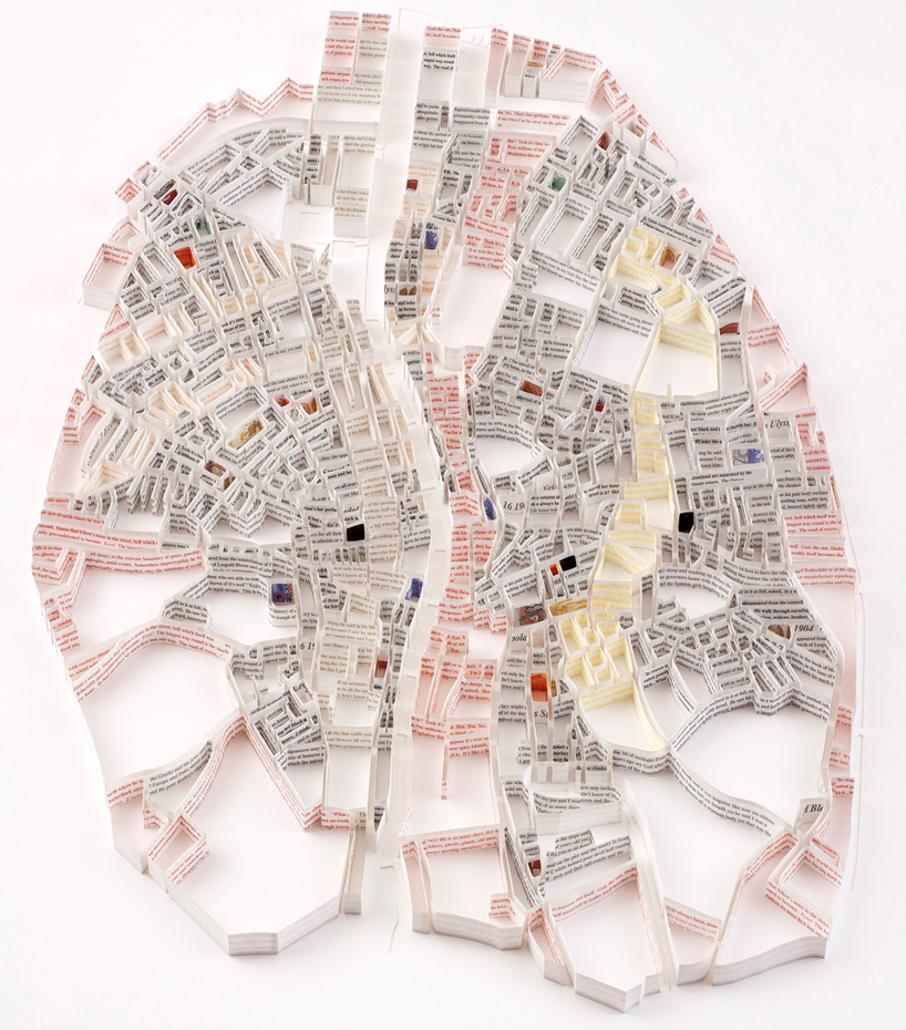
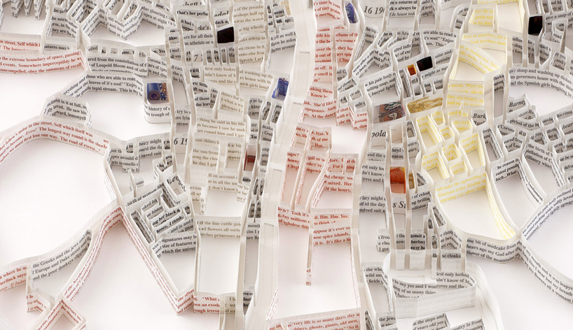
Matthew Picton's paper map sculptures

Paper Map Sculptures

 (This article has been taken from designboom)

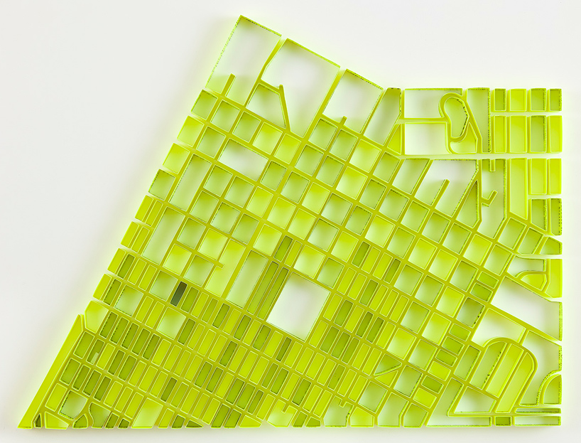
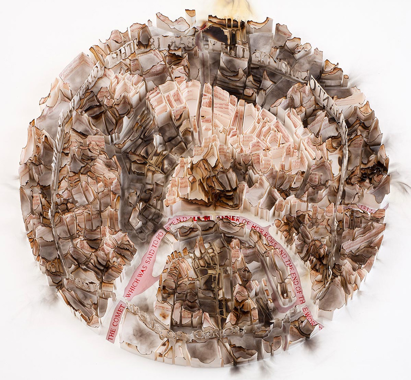
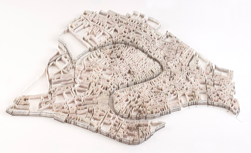
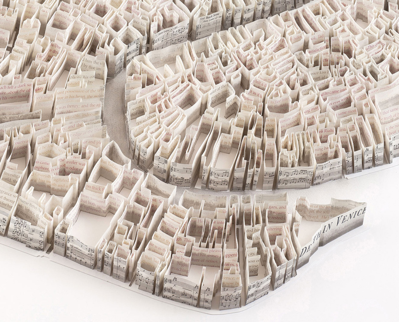
"matthew picton is a British born artist living in Oregon  USA. his work is influenced by cartography and the inherent beauty of lines and forms that arise from natural topography and built environments. his series of 'city sculptures' look at the organism of the city as an entity which has been shaped by social, political, economic and topographic factors, illustrating a systemic pattern of human civilization. he explores roads at the micro level, tracing miniature byways in cracked sidewalks and alleys.

A continuous visual narrative of a city's transformation, his sculptures are layers of history, documenting their early beginnings and depicting their contemporary state, expanding beyond their original forms. meticulously built by hand from individual strips of paper, each sculpture is more than a mere three-dimensional city map. Picton tries to emphasize a city’s distinct and unique personality. several of his maps depict cities such as Venice, London, Las Vegas or Moscow before and after a war of natural disaster, using charred or crumbled paper."


Las Vegas


Moscow 1812


Venice


Venice (close-up)


Dublin 1904


Dublin 1904 (close-up)

Wednesday, 26 June 2013

Tatiana Bilbao's Geometric Shapes

Tatiana Bilbao 09

Biotechnological Park, Culiacan, Mexico, 2013

Azure recently published Mexican Architect Tatiana Bilbao's profile and the way she uses geometric shapes really caught my eye. I love how the forms intersect and join. Each shape, and line has its own identity, and yet it is at home with its surroundings.

(link to the article here)

Tatiana Bilbao 08

Open Air Auditorium, Culican Botanical Gardens, Mexico, 2005-2014

Tatiana Bilbao 02

Jinhua Pavilion, Jinhua architecture park, China 2007.

Thursday, 6 June 2013

Fujimoto's transparent landscape

This is the 2013 Pavilion of the Serpentine Gallery by Fujimoto. Its a steel structure, just so lovely, and delicate... he designed a cloud that looks light and ethereal hovering over the land.


Read about it and for more pictures here.


Sunday, 2 June 2013

Architecture and Sociolinguistics

There are many parallels that can be drawn between Architecture and Sociolinguistics, these both fields of applied knowledge share certain common elements which keep showing up. Though it is an old subject, the rapid changes in technology and global economy have created an environment that is unusual to past eras of design.

The primary task of Sociolinguistics is to map linguistic variation on to social conditions, and as Bernard Spolsky writes in his book 'Sociolinguistics', this mapping helps to show two major kinds of variations in language: the first is Synchronic variation (variation at a single point of time) and the second is Diachronic variation (variation over a longer period of time) which is significant changes in language.

Architectural Sociology studies buildings and their use in social contexts. By observing and mapping the use of structures and the needs of the people we may be able to observe not just diachronic changes but also synchronic changes which are happening now. With so many changes in technology taking place such as 3D printing, advances in Artificial Intelligence and robotics, the need to understand the complex interaction between humans and their environment spanning over a period of two years and less has become crucial to designing interiors.

I will be studying and trying to observe more from this perspective and I will try and journal about it here as much as I can.

Thursday, 2 May 2013

Delightful Labour

"The artist's hand does not crawl aimlessly over the paper and trail behind it flowers of the imagination. There is scope in ornament for all the fancy of a fertile brain; but design is no mere overflow of a brimming imagination; it is cunningly built up on lines necessary to its consistency, laboriously, it might be said, were it not that to the artist such labour is delight".
(Lewis F. Day, Pattern Design, 1923)


Redesign of the Queen City Yacht Club, Toronto.

Before:


After: