Saturday, 26 April 2014

Thesis: Centre for The Visually Impaired - The Design 2

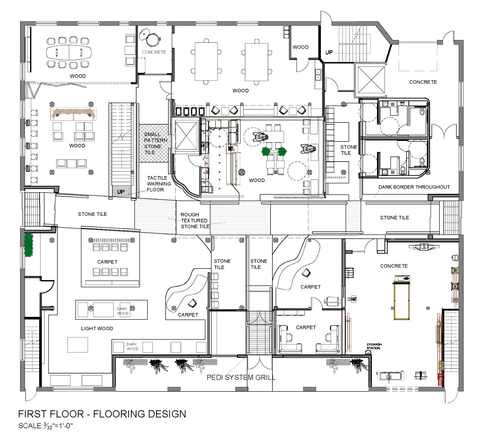
The Plans & Sections


Section 1

Section 2

Section 3

Section 4


Renderings


A strong contrast of colour and materials

Main Entrance


The Cafe


Tactile Art in Bronze in the Cafe

Tactile Clay Art on the curved wall leading to the Clay Studio

The Retail/Gallery displaying student work


Tactile Art in Wood outside the Wood Workshop


The lounge & meeting room behind it - The Business Centre

Staircase leading to Second Floor


The Staircase - It reaches up to the roof and has a skylight


The Second Floor


Tactile Painting outside the Painting Studio


The Painting Studio


The Library -  Attempts to maximize daylight with cuts in the ceiling overhead


Thesis: Centre for the Visually Impaired - The Design 1

There are so many thoughts that go into a design when putting it together, especially a design that is created for a sensory experience where all the elements may not be apparent to the visual senses. 


Natural Light Levels


Noise levels - as produced by the different areas


Activity Levels


Vertical Movement


Program adjacencies


The grid of the city


In Toronto we orient ourselves with the grid the city was designed around. That is an influence in creating the plan of the interior, to enable a more natural and instinctive method of orientation.

The grid of the site

The building has a 200 yr-old timber structure which also creates a natural grid.


Thesis: Centre for the Visually Impaired - Ideation and Sketches

Initial thoughts


The design of the tactile and sensory experiences have been inspired by the work of Alvar Aalto. He took the sensory experience into account when designing.
Villa Mairea (www.pinterest.com)
Heilig-Geist-Kirche Wolfsburg (www.wikiartis.com)
Riola Parish Church (www.archdaily.com)
Viipuri Library (http://www.alvaraalto.fi)


The pulled back entrance will serve as a sheltered area for people and the lines of the ceiling will draw them in, right into the heart of the space: the cafe. The movement of the lines continues upward to further draw the eye and as an invitation to explore.


Architecture than can be experienced by touch: Design must not be limited to the vision


Light Levels - Calculations and Visualization